

FLYING THE FLAG
Housing association Flagship Group had a confusing brand that didn’t reflect its operational reality. How did a new approach to its brand architecture and brand communications help the organisation change. Brittany Golob reports
The changes undertaken in the past six months or so at Flagship Group now feel natural for the organisation. Its brand architecture reflects its operational reality and its visual identity is a vibrant, simple and cohesive representation of its character. But, prior to March, the organisation owned two brands with individual visual identities and had no corporate-facing communications.
Now, the new Flagship Group – born from the Flagship Housing Association – is the proud overarching brand under which Flagship Homes and RFT Services happily sit. A new brand name and architecture helped the group redefine its positioning, internally and externally. But the change did not happen overnight.
Flagship approached London-based brand consultancy Frank, Bright & Abel to see if its existing brand was suitable. “We wanted to really understand our strengths and values and to see whether or not they were represented by our current brand, because we wanted to stand out in what is a busy marketplace,” Flagship Group’s director of communications, Lorna Blackmore says.
Frank, Bright & Abel undertook research into the Flagship brand – interviewing stakeholders, surveying customers and speaking with leaders and employees – to understand if and where the brand was failing. Rebecca Price, partner at the consultancy, says Flagship had begun to expand its service offering to better enhance its sustainability. The organisation operates nationwide, but with a focus on East Anglia and on providing social housing. But it had become a regional leader in maintenance and repairs through RFT Repairs. Price says, “In the space of just two decades, they’ve become more complex, more sophisticated and more importantly, today they have to communicate to a wider and more diverse group of audiences.”
The problem, though, was with the brand architecture. The organisation had two brands with equal equity in two different areas of business but appealing to the same partners and supporters for funding, expansion of customer base and awareness. The Frank, Bright & Abel team also did an audit of other housing associations to see how the sector was facing similar challenges and develop a way in which the new Flagship Group brand could stand out.
 “The view that we arrived at was that the brand architecture or the way in which they manage their family of brands really needed to change,” Price says. “The relationship between RFT and Flagship needed to be clarified.” Thus, the first major change to the brand was made as Flagship Group became the master brand, with RFT Services – which no longer dealt with just repairs – and Flagship Homes becoming equal sub-brands.
Blackmore says this clarification of the brand architecture helped clarify the internal structure of the organisation. She says, “The brands are very disparate so we wanted more around not just external engagement but internal engagement so that we’re all part of the same family. It was something that would have to be reflected throughout the brand so that’s what the architecture reflected.”
But the change also gave the organisation a single voice with which to address the financial community. The Flagship Group brand gives the organisation license to communicate with funders, regulators and the business community with a more serious tone. RFT Services and Flagship Homes are the consumer- facing brands and have a more conversational visual and verbal tone.
The language guidelines Frank, Bright & Abel developed had to be flexible enough to remain consistent across the three brands but to also effectively serve the needs of all stakeholders – people living in social housing, those in shared ownership with Flagship, funders, 22 county councils, maintenance customers and others. “It’s about plain English, cutting out the jargon and making your point as clearly as possible with as few words as possible. With funders, there’s no reason that the language should be difficult because if you can say something clearly, then everyone understand,” says Blackmore. Price adds that using a consistent tone of voice and language guidelines across the organisation has allowed for flexibility, but it is also more efficient. She says the new brand had to be professional, but not look as if the project spent money unnecessarily.
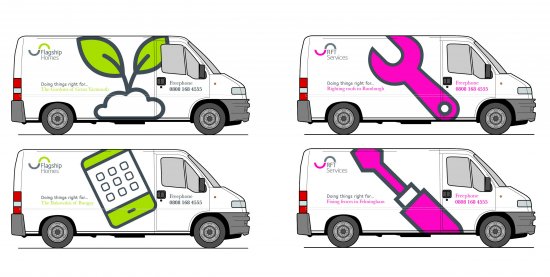
Thus, consistency is key for Flagship Group. The visual identity itself is simple, consistent and modern and eliminates of lot of the complexities from the old Flagship Housing and RFT Repairs brands. The wordmark for all three brands is comprised of a wave image that represents protection and support. The curve is then complemented by the brand name in a friendly sans-serif typeface called Speak. “It’s easy to read and straightforward, but it has those rounded qualities that make it feel approachable,” Frank, Bright & Abel creative director Janet Edwards says. “It’s distinctive so it has this warm feel. It’s not a cold corporate font because of the roundness of the characters.”
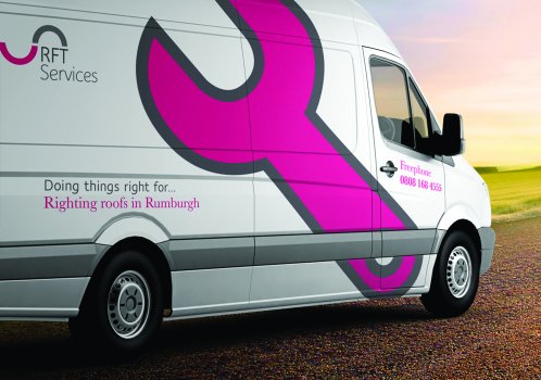
Each wordmark is bestowed with its own primary colour – steely grey for Flagship Group, green for Flagship Homes and pink for RFT – that is then complemented by the rest of the group’s colour palette. The pink and green are not new to Flagship as they had been the main colours of the RFT Repairs brand. When Frank, Bright & Abel surveyed stakeholders about the Flagship Housing Association brands, they found that brand recognition for RFT Repairs was strong and was centred on the colours of the vans and uniforms – pink and green. “It was something that everybody felt very strongly about and felt was very successful,” Edwards says. The vans themselves act as the brand’s billboards on the roads of the east of England and the uniformed servicemen are the brand’s ambassadors. That brand equity was an important element that was then built into the new brand.
Once the logos were developed, Frank, Bright & Abel worked on completing the brand system with imagery, iconography and web design. The icons it has created reflect the curvature of the Speak typeface to promote consistency across the brand system. They are also playful and friendly, but flexible enough to be used across the business’ three brands. The photography incorporates images of Flagship’s existing residents in their homes, with careful attention paid to representing the diversity of an organisation that serves communities from Cambridge to Colchester to King’s Lynn. Icons and cut-out photography is more functional, depicting scenes of home life – like beans on toast – or the tools of the RFT trade.
The challenge was to make sure everything was flexible and fun. The newsletters and customer communications from Flagship Homes have a sense of fun and RFT’s imagery is lighthearted, while the Flagship Group uses a more staid colour palette but employs similar photography and iconography. Edwards adds, “I think [flexibility] is very important because this was very much a brand that was going to be handled by Flagship internally, but also by its local communities, so we gave them a toolkit that they could draw on for their communications.”
|
Peer review Housing associations face an uncertain future, but FB&A have provided really solid ground with this rebrand. The result is a far less corporate brand, with a strong identity that feels trustworthy, a personal tone of voice and clear brand architecture. The dark grey palette with accents of bright colour for customer-facing brands cleverly balances security with optimism. |

With the brand system developed, the next step was implementation. Yet, with concerns for cost and the reception of the rebrand, Flagship has rolled out the new brand in stages.
The internal audience – comprising 880 employees – was communicated with throughout the rebrand process. “We didn’t do a massive launch,” says Blackmore. “We wanted to come out softly and for it to be a work in progress because rebranding is so expensive. We couldn’t afford to do a big bang process where everything was new the next day.” Thus, a three- year implementation plan is six months on.
The biggest component of the brand implementation will be RFT Services’ fleet of vans. The 300-strong fleet would require a huge initial investment – well over £150,000 – to rebrand at once. Instead, Flagship is applying the new livery to vans that have their leases come up over the next three years.
The vans themselves, because they are well- known on the roads, carry branded messaging as well. Additionally, uniforms were an important consideration during the rebrand. Not only should the uniform make RFT Services’ employees feel proud of their work, but they should be easily recognised by the people whose homes they are serving. Simple charcoal trousers were paired with a pink, RFT-branded polo shirt. Like the rest of the brand, it’s a practical, straightforward solution.
The messaging draws on Flagship’s new strapline, ‘Doing things right,’ and focuses on serving the community, and is heavy on the alliteration.
After the initial launch – at which employees thought the Flagship Group grey was unexciting – Flagship polled its internal audience and found the response to the rebrand was 90% positive. “After six months, everyone can see how it all works together and that you do need that subtlety,” Blackmore says. “The suite of colours and accents do work really well and it translates across the whole platform, as well as the collateral and merchandise, it looks great!”
The new brand system is not complete without complementary messaging, though. The ‘Doing things right’ strapline forms the core of this and messaging extends to focus on the organisation’s social purpose and role within the communities in which it serves. “It was forever asking ourselves, ‘Has this got enough stretch in it? Does it meet the needs of everybody without patronising anybody? Is it everyman but still distinct?,” says Price. This strategy brings together Flagship Group’s visual identity with its communications in order to best communicate with all of its audiences. Flexibility and consistency will also allow for Flagship to move forward in the future. The new brand architecture is primed for future, though as yet unplanned, growth and the visual system and communications strategy are centred on the brand’s core message, ‘Doing things right,’ which can then be applied to anything Flagship pursues in the future.
The solution seems simple, logical even. The brand architecture is clear and the visual identity striking, but the process of getting there required a deep understanding of the organisation itself and the housing association sector in general. The rebrand does indeed do things right. n


