IN LIVING COLOUR

- Digital & Video
Molly Pierce considers how colour has become a crucial part of many brands, and the other components of iconic identities
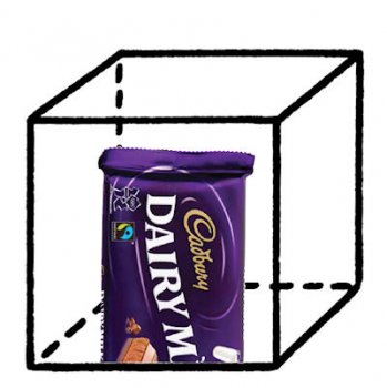
In October, Cadbury won a legal battle with its confectioner rivals Nestlé. This was the conclusion of a court debate that began in 2008, and the High Court’s ruling could have major ramifications for the communications of both companies.
 The clash wasn’t over the name of a chocolate product, or secret manufacturing formulae; rather, it gives Cadbury exclusive rights to the use of Pantone 2685C in the packaging of chocolate bars and drinks. An earlier ruling, handed down in December 2011, trademarked the purple shade for Cadbury, but Nestlé appealed claiming that colours could not be trademarked. Nestlé will have drawn on section 3 of the Trade Marks Act 1994 in its appeal, which states that a trademark must satisfy the requirements of being a “sign” and being capable of represented graphically. Judge Ian Birss eventually concluded that Cadbury could register the colour as a trademark on the basis of its “acquired distinctiveness” and the fact that it has been linked with the company’s milk chocolate products since 1914.
But why was it so important to Cadbury to win this decision? And what prompted Nestlé to appeal it at such length? What does colour mean to a brand?
Frances Redding, senior artworker at Endpoint, points out that Pantone didn’t actually exist when Cadbury began using the specific shade of purple. But when the colour referencing system was developed, “Cadbury had the foresight to select a Pantone reference to ensure future colour consistency. In designating an industry standard swatch to its colour, Cadbury is ensuring that there is an embodiment of that colour available to every manufacturer they ever need to use, and is limiting the usage of that particular colour by competitors.”
From an intellectual property standpoint, it was crucial for the decision to go Cadbury’s way. Ed Meikle, IP partner in DWF’s food group, says that you cannot underestimate the importance of the ruling for Cadbury’s brand: “Arguably, the colour is one of the chocolate manufacturer’s most important assets.” Pantone 2685C links Cadbury, which is now owned by the global food business Kraft, with its heritage in British industry, and with its emotive connotations for generations of consumers.
“Only very large businesses, with significant comms spends, are able to have that recognition within their sector in relation to a single colour,” says Meikle. “So you don’t come across them that often, but when you do they tend to be well-known.” Other companies that have registered colours as trademarks include Orange’s orange for mobile phone services, BP’s green for petrol stations, and UPS’ brown for parcel delivery services.
“Each trademark is limited in scope as to usage,” says Meikle. “There are instances where businesses are using very similar trademarks but in different areas: Polo is used by VW, by Rowntrees, by Ralph Lauren, but they all happily coexist. But trademark registration is a monopoly right, a stick with which to beat your competitors – and free market governments give out monopoly rights only under very exclusive circumstances.”
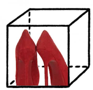
Another high profile colour branding case was brought this year in relation to the shoe company Christian Louboutin. The bright red soles of Louboutin’s shoes were imitated by Yves Saint Laurent, and a judge eventually ruled that Louboutin’s red was “a distinctive symbol that qualifies for trademark protection” – but only when the red was in contrast to the shoe’s upper.
 So although Louboutin’s branding rights were upheld, YSL has been able to continue making shoes with a red upper and sole, as this doesn’t contravene the trademark.
Colour has become a crucial part of building an iconic brand for many companies. Clive Rohald, creative director of brand development at Siegel+Gale, says that trademarking a colour is a strategic decision. “Cadbury invested money and time into developing this proprietary colour, which makes the visual recognition of the brand iconic. If a brand has invested in a colour, why not own it?”
The need for strong visual properties is related to the challenges a brand faces in trying to develop a powerful corporate identity. “We live in a world where we’re bombarded by messages and clutter,” says Rohald. “Brands need to cut through that confusion, and one of the ways in which they try to do that is through the development of a new visual language – an iconography.”
But what is an icon? It’s effectively a symbol that helps to communicate a complex set of ideas in a simple way. Rohald brings up the concept of ‘speed to brain’ – there’s a functionality to iconic brands that deliver information quickly or cause instantaneous recognition through their visual identity.
“An icon endures. Some of the oldest known marks are in the Chauvet Cave in France – these are images that were made 30,000 years ago. They’re iconographic in their own right because of their simplicity: this has enabled them to stand the test of time. For a brand to become iconic, it needs to have a very strong, singular point of view, which comes back to what a brand does. You need an extremely single-minded idea to put across.”
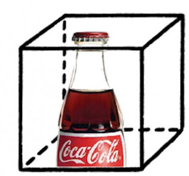
A classic example of an iconic brand is Coca- Cola, whose curvy bottle is also a registered trademark. Meikle comments on the registering of shapes that “for a judge to grant the trademark, a brand needs to be iconic already. You can register a shape and a sound for a brand, because they can be represented graphically in a permanent form.” Hence the importance of a colour registration system like Pantone; and the difficulty perfume manufacturers have faced in registering certain scents, which Meikle says is “virtually impossible” under current case law.
 So Coke had an iconic brand by the time it registered its bottle design, but its branding and communications had gone beyond the visual to get there. “It isn’t just about the design,” says Rohald, “it’s about the experience, the movement, the commentary on the world. In the Seventies Coke did an advert where the soundtrack was I’d like to teach the world to sing. That song became embedded in the national psyche – Coke had recognised that it was tapping into culture and behaviour, and chose that song to comment on and unite American society post-Vietnam. It also recognised early on that it needed to transcend its visual brand.”
The locale where visual and verbal communications cross each other is in a brand’s typography. Bruno Maag trained as a typesetter and set up type design agency Dalton Maag in 1991 – the business now develops fonts for companies as diverse as Nokia, McDonald’s, and BMW. Maag says that he believes typography is the branding element that can communicate across all cultures and media.
“It’s a very basic form of communication – a specific typeface can be recognised in any language. Types enforce a brand.” The Roman Empire was one of the first organisations to acknowledge and exploit the power of typography to establish a brand. “The Romans formalised lettering, and they made it look good,” says Maag. “As they were conquering Europe and large parts of the world, they took their lettering along with them as a political statement. Once you saw the lettering you knew you were in a part of the Empire. And if you look back at history, they were pretty good at establishing a brand in the broadest sense of the word.”
Lettering was extremely functional, but as businesses began to realise that typefaces were a communication channel, they started to explore the emotional attributes of fonts. “One of the world’s best known typefaces was registered in 1917 – the font that London Transport commissioned from Edward Jones. It’s still in use today, nearly 100 years later: there have been slight updates, but it retains the essential elements. The type needed to be very legible, to have a unique appeal, and to provoke instant recognition.”
As with specific visual symbols and colours that make up a brand, developing a type goes back to summarising the organisation’s purpose and worldview. Dalton Maag worked on updating BMW’s Grotesque font, replacing the Helvetica font that had been in place since the 1970s. “First you have to try to understand the attributes of the client. How do they want to be perceived?
BMW’s brand is built on precision engineering, which is quite cold and technical. So the typeface had to have that geometric, mathematical aspect, and each lettershape was created in line with that message. It looks machine-made.” BMW’s font is very different to a consumerfocused font, which Maag says would usually have “more humanistic, open, warm, friendly strokes, with proportions that are derived from handwriting.” The process of designing types for brands has changed drastically in the last twenty years, because creating them using a computer programme is much simpler than setting letters in hot metal – which was the established system just fifty years ago.
Maag and his team work closely with branding agencies on most projects. “They have an overall view of the brand, and they know the clients, so they can channel the necessary information. You can’t isolate a typeface from an overall brand structure, so it’s a good thing to have a brand agency controlling and art directing the visual development of a font. The typeface needs to fit into the whole visual expression of a brand.”
But what about when your brand doesn’t have a strong visual identity? Is it still possible to have an iconic presence? To Clive Rohald, the answer to this question lies in the changing ways in which audiences interact with organisations. It’s also ‘Yes’.
“The world has changed so dramatically over the last 15 to 20 years that we need to question our perception of what a visual identity is,” says Rohald. “It used to be built on a logo, colour, name – now it’s more about emotion, experience, sound, touch. Is it possible to have a great brand without a great visual identity? If you think of a brand in terms of experience, then yes. Consider Apple and its consumer environments: the endorsement on the store is minimal in terms of the visual brand, but what makes it Apple is the materials, the mood lighting, the architectural components like the floating staircase. The psychological POV of Apple’s brand is to entice, so if you took all the products out people would still feel that they were in an Apple store. Muji’s another example – it literally means non-branded, which has in turn created a very strong brand.”
Rohald believes that we need to start challenging the vocabulary of visual identities, especially when it comes to online communications. “What we have tended to see is that in more mature markets, eg Europe, people understand the power of the experiential. In less developed comms markets, such as the Middle East, the tendency is do more in terms of logos. There’s an opportunity to broaden this.
“For any brand today, survival will be based on experience – not just slapping a visual symbol on and hoping it will do the job. We have far more mature, expectant audiences now, whose tech levels are higher, and who want innovative methods of communication. We need to define effective and simple experiences that will allow brands to grow and move into the future.”