A PRIVATE MATTER

- Corporate Affairs
You don’t wake up one morning and find that your brand is suddenly out of date, but it happens slowly if you’re not mindful,” says Richard Caston, managing partner of RJD Partners.
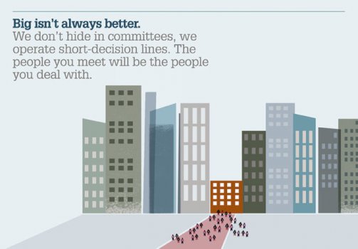 From its very start in 2001, RJD Partners has prided itself on specialising in investing in the services and leisure sectors, with a personal and approachable outlook suited to entrepreneurial and family-run businesses needing an investment partner. RJD continued to operate successfully within its niche, making investments from £5 million to £25 million in deals worth up to £75 million. But the team recognised that the website, which is key to attracting portfolio companies in RJD’s target group, was outdated and not up to speed. “Our view is that it is the nature of websites to look outdated very quickly if you don’t do anything with them,” says Caston. “Our own business had moved on, both because of changes in the team and because of the evolution of the sector. The generic photos on the website, for example, looked out of date.” So RJD drafted a brief focused around the design of a new website. Rebranding wasn’t mentioned in this original brief, and this was a deliberate decision. When Caston teamed up with John Dillon and David MacLellan to pool their mid-market private equity experience to found RJD Partners in 2001, they had a very clear idea of the kind of firm they wanted to create. The core strengths were to be the sector specialism, the experience with lower mid-market companies and the approachability of the firm. These core strengths were persisting and continuing to deliver in 2010 when the brief was written. “One of the businesses we deal with is based in Guernsey and on the high-street there, the Boots store displays a decades-old logo. It struck me that to avoid that sort of thing many subtle changes are usually made in a business over time. And that’s what we were going for to some extent.” One of the three agencies to pitch to RJD in response to the brief was London based corporate brand and website design agency Design By Structure. Brand:rebrand When the team at private equity firm RJD Partners decided that the website was looking outdated, little did they suspect that the redesign would involve so strong a reaffirmation of their brand. Lizzie Thomas reports 38 Communicate February 2012 A private matter ” “RJD came across work we had done for another private equity company, one of its competitors, and we were invited for a discussion,” says John Galpin, managing director of Structure. Following the initial discussion, Structure delivered a pitch that was based on rebranding the business according to the firm’s existing core strengths. “The pitch for the website was speculative, based on the initial meeting and our in depth experience of the market,” says Galpin. “RJD was the smallest private equity firm we had worked with and this personal culture was key to our proposition. We saw this as an opportunity to communicate what made the firm different and to build its personality. Then creating the website would be relatively easy as there would be a great message to build it around. They loved the approach!” This marked the start of a strong relationship between firm and agency. Caston explains the decision to engage Structure: “We felt we could have the most interactive and collaborative relationship with them throughout the developing process.” Part of Structure’s remit was to consider the users of the website and carry out research into their perceptions. Based on previous experience with private equity firms, Structure decided to interview members of some of the firm’s key audiences. “We spoke to four of RJD’s most recently engaged portfolio companies,” says Galpin. “We also spoke to intermediaries such as Grant Thornton, Deloitte and PWC. Deal opportunities often come from such ‘match making’ firms, so it was logical to have them on board as advisors.” When Structure came back to RJD with feedback from the research, RJD was encouraged to use the core strengths of the firm in an overt way. Galpin explains, “from our research, we realised that the small size of RJD was perceived as an advantage as the person you meet has power to make decisions. So the question was, how best to communicate this advantage.” This distinction is particularly important to RJD’s niche in family-run and owner-entrepreneur companies. This niche also means that RJD often deals with companies seeking to approach a private equity firm for the first time so it was important that the design would not look overly corporate, but would promote the open, inclusive approach of the firm. To stay away from the financial services look, Structure’s proposed illustration style was different to the photographic style that the majority of their competitors suggested in their pitches. Instead, the design makes use of block colour and straight lines, communicating the culture of the firm in a modern and accessible fashion. The focal point for the illustrations is a set of three RJD facts: ‘Bigger isn’t always better’, ‘We’re service sector specialists’ and ‘We put people first’. These three key messages about RJD reaffirm the firm’s inherent strengths and communicate the new stronger brand. Much of what was presented to RJD in the proposal meeting appears on the new branding, particularly the illustrations. The presentation was well received and was so successful partly due to the collaborative relationship between agency and client. Caston explains: “It’s hard to identify which ideas were ours and which were from Design By Structure, when they all came out of discussions.” Galpin describes the results of the presentation, “One thing we did have to refine was some of the messaging. We tracked back with the concept andthe tone of voice behind the messages so that they were comfortable with them. ‘Big isn’t always better’ was in the original pitch, for example, but we had to refine how we articulated ‘putting people first’ so that they were comfortable with it. We were a bit more ‘out there’ originally but the refinements were more about detail than content. The management were very positive; they really bought into the kind of creative we pitched in and the concept of being friendly and approachable.” Because RJD often deals with companies new to private equity, the website is deliberately easy to navigate, Caston explains. He adds, “Our business is about a small number of important interactions so it’s important that people are well informed before you meet.” Structure designed the information architecture of the site and templates for fresh marketing collateral for use with the new integrated email marketing system. Structure also provided a brand toolkit including a PowerPoint template and brief brand guidelines, outlining both visual and comms aspects. “We often refer to the brand guidelines,” says Caston, “especially as we continue the process of rolling out the logo, stationery, newsletters. It is case of keeping us up to date and looking contemporary.” But as Galpin explains, the work Structure did wasn’t just about visual identity but about what makes RJD stand out as a firm. “When we looked at RJD’s existing collateral originally, it included something it called ‘the RJD difference’, on the basis of which we created the three RJD facts seen in the illustrations. The brand guidelines include the tone of voice to use in order to remain consistent with the three RJD facts and to keep in mind the kind of people RJD usually works with.” He concludes, “The brand messages are different to other companies’ because RJD is different to other companies. It’s not going to be to everybody’s taste!” “The firm has invested a lot of time and care in the project,” says Galpin. “Those involved had to work hard, especially on writing the case studies, but RJD has been really engaged and made sure that it’s moved forward.” A close-knit team of 14, RJD is small enough that all its members were involved from the start of the process. Galpin was pleased with the progress, especially given the small team, and the site went live in September 2011. “It’s an ongoing process,” says Caston. “We were relaxed about not achieving consistency instantly, but we aren’t relaxed about sticking to our time schedule. We expect it all to be in place by end of the month.” The next stage for the team at RJD Partners is to revisit their investor communications. The team doesn’t actively engage investors every month, but with many of the investments from their two funds now fully realised, they are looking ahead. “We’ve engaged Structure again to deal with this,” says Caston. “Investor relationships require a smarter, more corporate approach.” Because of the private nature of investor relationships, this next process will be conducted behind the scenes. But both agency and client are adamant that work done in this next stage will maintain consistency with the work that was started over a year ago with the brief to redesign the website. Neither party has solicited any feedback, but Caston lists the positive responses they’ve received as one of the reasons RJD has such a good relationship with Structure. “The website assists in bringing in people who are informed about us before they pick up the phone,” says Caston, describing the effects of the redesign on the personal interactions which are key to RJD’s business. “We also deal with intermediaries, and in that population, too, we have received a strong feedback response.” The team at RJD was also pleased with the case studies, and this display of their work has been uplifting for the team members, as well as the positive reaction from business owners .
Peer reviews
Paul Spiers, Amplifier
Overall, I’d say the RJD rebrand appears successful. The new visual identity strikes a decent balance between the increasingly complex private equity sector and the unique personality inherent in a family-run business. It’s clear RJD wanted the latter to come through and it does. Visual identity isall about customer confidence. Fresh vibrant branding equals customer trust and engagement. Tired/outdated equals questions on delivery, integrity and service. The RJD site delivers confidence.
Anne Bahr Thompson, Onesixtyfourth Emphasising RJD’s point of distinction – its size offers the benefit of meeting the person who has power to make decisions – is strategically sound. The key messages “bigger isn’t always better” and “we put people first” appear to be genuine to how RJD works. However, the visual vocabulary doesn’t reflect the values these represent. While the website is approachable, it may be too comfortable or homey. And although the illustrations are memorable and clever, the imagery brings to mind the opposite of putting people first. The little black and red people lining up conjure up industrialisation – a light-hearted Lowry painting, perhaps.