TAKING ACTION

- Corporate Affairs
Action on Hearing Loss – the former RNID – estimates that 10 million people in the UK suffer with hearing loss. A new brand to mark a very special birthday is designed to help the charity reach those people. Molly Pierce reports
 Action on Hearing Loss began life as the National Bureau for Promoting the General Welfare of the Deaf in 1911, when it was founded by Leo Bonn. Its fifty-year anniversary was marked by a name change to the Royal National Institute for the Deaf – and now, in its centenary year, the charity moves into its next phase as Action on Hearing Loss.
This most recent name change was part of a wider rebranding exercise undertaken by the charity in conjunction with hat-trick design and Spencer du Bois, prompted in part by the need to mark the organisation’s 100-year anniversary. There was also a pressing business need behind the rebrand – research undertaken in 2009 showed that the charity had just 4% awareness among the general public.
Emma Harrison, director of public engagement at Action on Hearing Loss, says that the revelation of this low awareness was a wake-up call for the organisation.
“We commissioned Matter Communications to carry out further research, which showed that under the RNID brand, we were seen as trusted but oldfashioned – and not particularly caring, which is odd for a charity,” she recalls. “Having spoken to over 3,000 stakeholders, we presented the board with the research, and said we really felt that we needed to change our name.”
Winning over the board would prove tricky, however, particularly on the heels of the disappointing awareness figures. Eventually, Harrison and the team at Action on Hearing Loss got permission to change the charity’s name – but only if the new name was a truly better representation of what the charity did.
The new name needed to convey the fact that RNID was something of a misnomer – it had evolved into a charity that focused on all aspects of hearing loss, rather than sole concentration on the deaf community. “We actually work to eliminate and provide support for those suffering from hearing loss on many levels, from campaigning for biomedical funding and lobbying the government, through to the provision of care,” explains Harrison.
“The name also had to address a major divide in Action on Hearing Loss’ audience,” says Gareth Howat, creative director at hat-trick, who came on board as the design agency for the rebrand in early 2010. “There’s the general public, who tend to take their hearing for granted; and then there’s the deaf community, who have a very different viewpoint. Action on Hearing Loss needed a name and a brand that could cross that divide, and convey that everyone can be affected by hearing loss.”
The charity estimates that currently almost 10 million people in the UK suffer from hearing loss of some kind, and that there are four million people who could currently benefit from hearing aids but haven’t yet taken action.
Strategy consultancy Spencer du Bois was brought in to consult with Action on Hearing Loss on the new name, and a shortlist of six – “whittled down from a much longer list of Spencer du Bois’ suggestions, together with input from members and staff,” Harrison points out – was put through extensive research with the charity’s stakeholders.
Action on Hearing Loss emerged a clear winner, as it is far more descriptive of the charity’s activities – though due to its Royal Charter, the charity’s legal name will continue to be the Royal National Institute for the Deaf.
Howat recalls that although hat-trick was involved in the creation of the new identity from the start, the decision on the name was a clear turning point. “The name was effectively the brief,” he says, “together with the research done by Matter. Then it was a question of the creative work – for which the most important consideration was always going to be the impact a new design would be able to generate.’
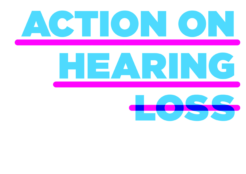
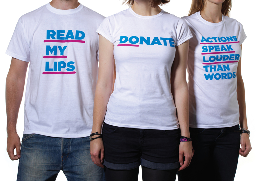 The new visual identity revolves around an underline/strikethrough motif and powerful blue and pink typography. “We emphasise the positive by use of underlining,” explains Howat, “and eliminate the negative with the strikethroughs. It’s a big, bold design, but the device can tie together the diverse range of applications produced by Action on Hearing Loss.
“For a charity brand, you have to steer away from the ‘me too’ in your identity, a problem that had come up in the initial research with confusion between the RNID, the RNLI, and other acronym-focused charity brands. Also, when charities spend money on branding, it really needs to make an impact – otherwise what’s the point? Each stage was thoroughly researched in order to justify the changes: it’s certainly not just a case of throwing money at the brand.”
Harrison is very enthusiastic about the new design: “It’s so bright and bold, you just can’t miss it! We’re going to be advertising later this year – for the first time in about five years – and there’s so much room to have fun with this identity, whilst still conveying a serious message. It’s really visual, which is important for our audience.”
Howat’s team worked closely with the in-house design and tech teams at Action on Hearing Loss throughout the process, taking a range of concepts to a small but cohesive steering group headed up by Harrison. In fact strong communication was key throughout the entire rebranding process, and Harrison emphasises the monthly updates to the executive team, and bimonthly board meetings. In a bold step, it was announced that the charity would be changing its name before the new name had even been decided on.
“We wanted to avoid shocking anybody,” says Harrison, “because it’s an emotive subject. We developed focus groups consisted of key stakeholders to test the new creative look: social media was incredibly helpful in recruiting people suffering from hearing loss for this, and helped us get key feedback.”
Action on Hearing Loss’ strong online presence is testimony to the fact that the community of people who have either partial or complete hearing loss use the internet in a very different way from those of us who communicate orally. “There’s a very strong uptake of social media and digital communications among that audience, with large online communities using Twitter and Facebook etc,” says Harrison. “At launch we switched over our social media accounts all at the same time, and unveiled the new website, which delivers a huge amount of functionality in terms of support and care. It’s a big, bold design, but we believe the device can tie together the diverse range of applications produced by Action on Hearing Loss.”
Once hat-trick had created the core brand guidelines for the team at Action on Hearing Loss, the new brand was in place – together with the website, built by Red Web, and signage created by Endpoint. “It’s a very wide-ranging identity,” Howat points out, “so we couldn’t get all the implementation done overnight, particularly on a limited budget. But we focused on really making an impact with the first reveal of the rebrand.”
“Our internal launch involved new signage in 20 of our locations across the country, the switch to the new website and social media accounts, and communicating to staff,” says Harrison. “We’re also planning a great deal of activity based around the new brand at festivals across the country this summer, promoting the value of protecting your hearing, so our new logo will hopefully be very helpful in talking to the under-30 audience.”
Action on Hearing Loss is an organisation whose communication needs are wildly varied – from festivalgoers to audiologists and MPs, Harrison estimates their stakeholders could be broken down into 800 distinct groups. In reality, the charity has reclassified them into four sections – public; supporter; service user; and key influencer – and has a very careful comms strategy in place to keep these groups up to date with the new brand’s progress and the charity’s work in the future.
“We want to show people that we still do all the things they knew us for,” says Harrison, “but we also want to get to the people who had no idea about us before. Our immediate target is to get that 4% awareness up to 20%.” But in the future, the charity’s ambitions are much greater. “Eventually, we’d like to be a household name, so that anyone who’s worried about their hearing will come to us. We want everyone to be aware of and protect their hearing.” Hopefully, with the help of Action on Hearing Loss, thousands of people affected by hearing loss will no longer have to suffer in silence.
Peer reviews
Doug James, Honey Creative
Always tricky to update and redefine an established charity, as Scope proved. Royal National Institute are hardly words that stir the soul and the new name has the great strength of Ronseal-like clarity. ‘Action’ rises above the charity buzz word cliché because action is their raison d’être. Equally, ‘Hearing Loss’ is more than a polite term for deafness. This repositioning clarifies their relevance to a wider group of people. Visually, the line through ‘Loss’ encapsulates the isolation that deafness brings. Colours are positive and contemporary without frivolousness. The website has a cleanness that I hope will last. Brilliant strategy, strong creative but the execution is a bit naïve and will tire.
Bob Blandford: Design Director, Haygarth
I really like the new brand name – it has a call to action, it’s modern, it’s inspiring and it also lends itself nicely to contemporary communications, which is so important in our fast moving environment. Visually the branding is striking, although I do think that it is lacking is a clear message and direction. Whilst the clean lines create good stand out for the brand, the mixed messaging of underlining the positive and crossing out the disability confuses me and doesn’t really tell me anything new. What’s more, the messages feel slightly patronising and perhaps a bit flippant, almost as if they have got a bit carried away with their play on words. Although I never got that pin dropping moment, I do think it could be significantly more exciting than their previous communications – I hope it proves a success.