FLYING THE OLYMPIC STANDARD

Rio’s Olympic Games in 2016 promise to be a riot of sun, sea, and sporting achievement. Its logo, on the other hand, has attracted some high profile criticism: we present the designs of UK agencies who think they could have done it better.
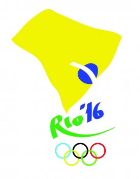
 Inspired by the geometric simplicity of iconic Olympic logos we deconstructed the Brazilian flag (a blue disc, yellow rhombus and green rectangle) and used the shapes to spell Rio. These elements represent the indoor, outdoor and water Olympic disciplines and, where before there were the stars of the Rio sky, we now see the Olympic rings glittering.
Marisa Tayti and Tom Ellis, 1HQ
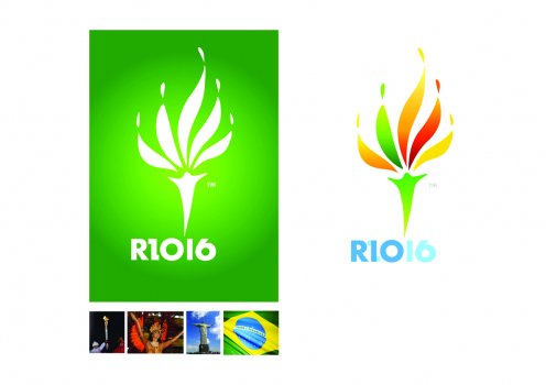
This design evokes the five personality traits everybody loves about Rio’s Olympic mix; Achievement and Aspiration in the outstretched hands and laurel-like flames, Passion in the fire fuelling the emblem, and Unity and Harmony as the intertwined dancers welcome the world to Rio.
Phil Murphy, Burson-Marsteller
The logo is comprised of expressive strokes and bold shapes. The expanse of yellow mirrors the contours of Brazil, the diamond of its flag and the flame of the Olympic torch. The blue circle and white line normally found at the centre of the flag has shifted as a focal point to where the host city is located in the South East. The logo embodies Rio with a sense of nation, play and fiery vitality.
James Harringman, Studio Harringman
 This design communicates the uniqueness of Rio by combining two of its iconic elements, Christ the Redeemer and a Carnival headdress, into an Olympic torch. These Rio icons represent spirituality and celebration, and these ideas are unified both metaphorically in the Olympics ethos and visually in this design.
Valeirio Motta, Emma Narramore and Tom Ellis, 1HQ
 Brazil’s got it all: sun, sea, style and now the Olympics. Although in the hotly contested bid to host 2016 Rio nearly missed out to Chicago; it was a close shave…
Chris Hart, Blue Marlin
 A classic brand collaboration; Jesus lends a top sporting event a sense of place, benevolence and that creator spirit. The church gets a sporty makeover, shaking off all those ‘old world’, ‘behind the times’ tags. It’s a win-win.
Simon Attfield, Blue Marlin
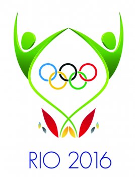
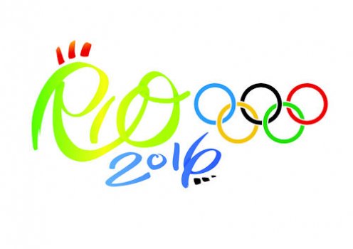 Rio represents a freedom and flamboyance to the world, most noticeably in their carnivals. We want Rio 2016 to be a celebration of sport. We’ve captured this in a free-flowing logo type that symbolises the energy that the city and the games bring to the world. Using carnival as inspiration, we want the free movement of the shapes to feel like a dance. We didn’t want a logo that was static. The decoration is like the feathers from a carnival costume, but also the flame from the Olympic torch.
Jon Sant, The Pulse Group