THE BUSINESS OF HEALTH

When Pentagram was asked to update the identity of one of healthcare’s oldest brands, it knew 150 years of history needed to be respected. But it had strong convictions about what needed to change. Frank Sutton reports on the new Bausch + Lomb brand.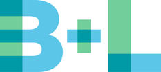
Founded in the US in 1853 by two German immigrants, Bausch + Lomb is one of the old guard when it comes to the business of eye care. From humble origins making monocles in pre-Civil War America, the company is now present in over 100 countries. Its heritage is in optical instruments – glasses, microscopes, binoculars, photographic lenses (the first Kodak camera featured a Bausch + Lomb lens) and last but not least, iconic ’80s sunglasses brand Ray-Ban.
Yet in recent times the company has evolved into new areas, and in 2008, with a new management team in place, the decision was taken to create an updated brand identity to reflect this.
“From contact lenses to eye medicines to products for eye surgery, Bausch + Lomb is now an expert in the field of eye health, and that’s what we wanted the new brand to portray,” explains Mike McDougall, VP corporate communications at Bausch + Lomb. Indeed, as if to emphasise this shift, its world-famous Ray-Ban sunglasses brand had been sold off a decade before.
Today the company’s best-selling products come from a growing pharmaceutical division. Think overthe- counter eye drops, vitamins, and prescription medicines treating allergies, dry eye and glaucoma. It also has a surgical division that develops products like the Crystalens, a surgical replacement lens for the treatment of cataracts.
Bausch + Lomb called on agency Pentagram to create a brand identity to communicate this evolution. Heading the design team was Paula Scher. “Organisations usually go through a brand refresh to signify change within the organisation and a change in strategy. This was true in this case,” she says. “The heads of the corporation were reasonably new and setting a path to the future.”
 But while her description of how the project had come about was unremarkable enough, get her on to the subject of the branding and packaging efforts of Bausch + Lomb’s competitors, and she is not a woman to mince her words. “You go to the pharmacy because you want something to make you feel better. Yet most of the time you come out feeling worse than when you went in.”
Her sense was that the application of some intelligent design was long overdue in the healthcare sector. “Almost all eye health products use the colours blue and green. Yet close your eyes and imagine those colours had become red, and suddenly you’ve got a cough mixture.” Scher believes the idea that people want or need certain types of products to automatically use certain colours, is “based on mumbo jumbo faux science. It’s insulting to the consumer.”
In fact, her approach to the Bausch + Lomb project was based on her wider design philosophy. There’s an almost missionary zeal in her voice as she sets out her stall. “For me and my partners, the thing that matters most is to try to elevate an entire category. If you lead the way then the rest of the market will follow. Ultimately you begin to improve those environments. To be able to go in and create branding that is a bit more intelligent and a bit kinder to the consumer is an important thing to be able to do.
“I may design an identity for a theatre company or a museum and it may be very beautiful but it’s also likely that everything else in that landscape is already beautiful. But when we went into the healthcare realm, what would we could do was huge.”
This conviction of what was possible, and this belief that every component of a brand identity should intelligently reflect something about the business, is evident in the work carried out for Bausch + Lomb.
The Pentagram team created a selection of possible designs. They were presented to Bausch + Lomb, who took the views of people across the organisation before a final decision was taken. “We worked and got feedback from people at all levels, from sales manager to finance director,” says Mike McDougall.
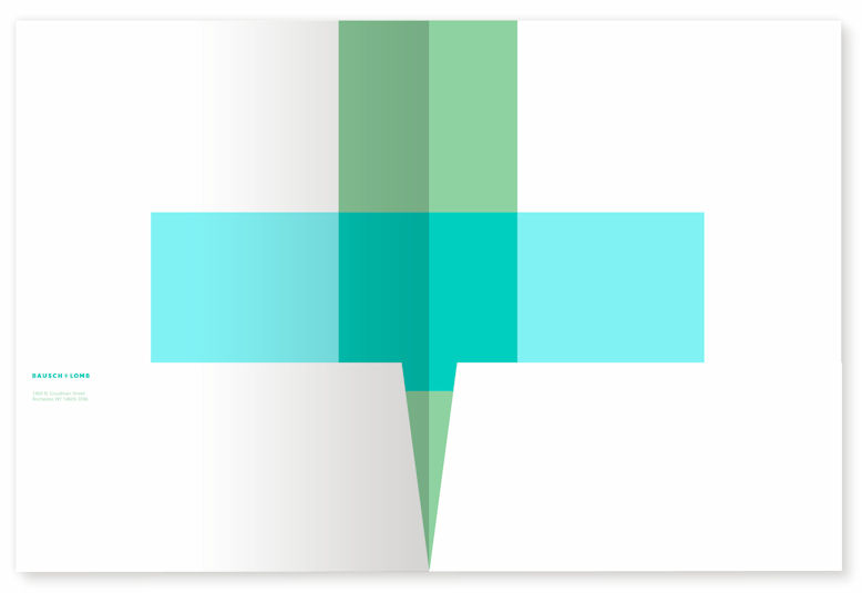
The previous logo represented the science of lenses with a graphic element that suggested angles of refraction. The new identity maintained the traditional corporate colours of blue and green but reinterpreted them in modern hues that suggest water, moisture and ecology, thus reflecting the company’s focus on eye health. The logo’s element of transparency suggests vision, as well as the liquid solutions that are an integral part of the company’s product lines.
The next significant change was the shift from ‘Bausch and Lomb’ to ‘Bausch + Lomb’. “The move from ampersand to plus sign is one of the most asked-about elements of the new identity,” says Mike McDougall.
“The plus suggests the idea of partnership, which is one of the most important Bausch + Lomb values. It’s what makes us tick. We work very closely with eye care professionals to get their feedback, both at an ideas stage and when products are in the marketplace.” “The plus sign was an instant way to say ‘healthcare’,” adds Scher, going on to explain how she was inspired by the blue and green pharmacy signs found in Europe.
The new Bausch + Lomb logotype is set in a proprietary font called Nobel BL, based on Nobel. The font is also used as a secondary typeface in all Bausch + Lomb communications.
The identity was unveiled in January of this year. Yet before it could be launched there were regulatory hurdles to overcome. “One of the reasons that a change in identity takes a while is the strict regulation in the healthcare sector. Any new branding on packages has to be approved by regulatory bodies in each region – and this takes time,” explains Mike McDougall.
Paula Scher is pleased with the final design – “we think we have created something that is handsome and not overly aggressive” – but in terms of the different elements of the brand, she says that so far we have seen just the tip of the iceberg. And it’s in the next couple of years that she thinks the new identity will really come into its own as it is applied to the hundreds of individual Bausch + Lomb products. In fact she is currently working on a set of brand guidelines for the teams in charge of the several hundred products currently sold by the company in pharmacies around the globe.
“Paula and the team at Pentagram have built in a lot of flexibility to how the new identity can be used. This gives our business units the freedom to use the identity in the way that works best for their region and products,” says McDougall.
This is especially important for over-the-counter products because they already have strong, clear branding on their packaging. Scher has worked hard to ensure that the corporate identity can be tailored and applied in such a way that each product is clearly from the Bausch + Lomb family, yet can retain its existing ‘personality’. As she puts it, “the corporate logo couldn’t afford to fight with [a product] logo.”
Scher ends by returning to her belief that branding in the healthcare industry should be looking to raise its game, to become a bit more intelligent. And she is confident that Bausch + Lomb has done that. “It will be the winner because of it. If you lead the way then the rest of the market will come up with you. Bausch + Lomb is doing it, and it should be done.”
Peer review
David Chapple, chief executive, Bostock and Pollitt
“The sort of intelligent work you’d expect from Pentagram. An identity refresh based on sound thinking but, equally important, it instinctively feels right. Gone is the geometric precision and sharp lines reflecting Bausch and Lomb’s instrument making history, to be replaced by a more soothing feel. I know which brand I’d rather be pouring into my eyes.
The softer approach just about avoids the pitfall of becoming less visible by the use of contrasting colours in the plus sign.
It is interesting the company chose to involve employees from across the organisation to input into the selection of the final design: great for employee engagement and buy-in, but I wonder whether we’ve missed out on something even more distinctive. In particular something that pushed the colour palette a little more outside of the safe ‘pharma’ blue and green?”